Wheel Of List
Wheel Of List
Section titled “Wheel Of List”What this project is
Section titled “What this project is”Wheel Of List is a great project for studying something many people underestimate:
a simple product done well.
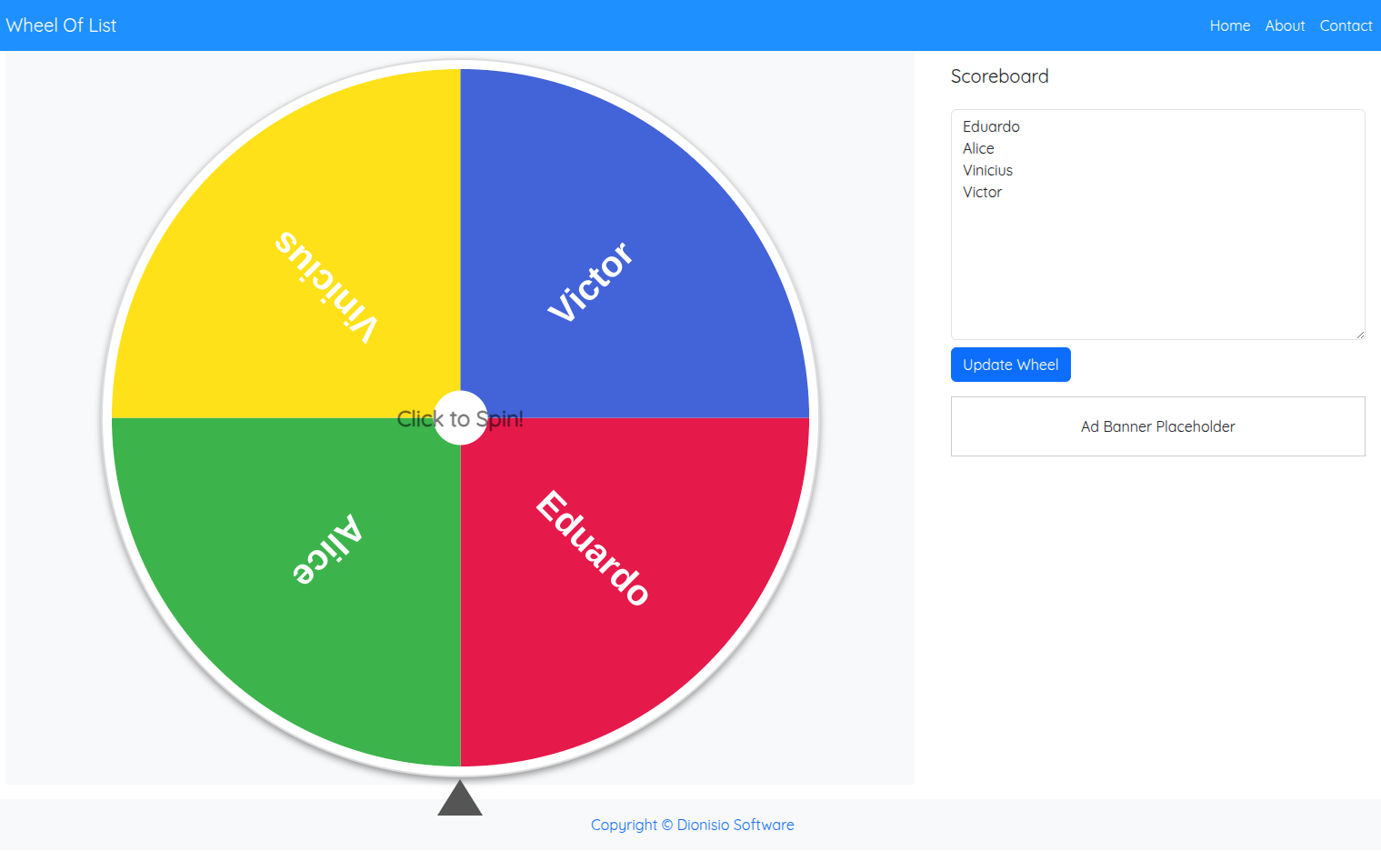
It takes a very clear need:
make random selection visual, fast, and enjoyable
and turns it into an experience that feels direct, practical, and satisfying.
Beyond the main spinner, the product also expands into adjacent tools like a random number generator and a dice roller.
That makes the case even more interesting.
What problem it solves
Section titled “What problem it solves”A lot of people need quick random selection without friction:
- classrooms
- raffles
- events
- team activities
- fast decision-making
The project solves that without requiring complex onboarding, account creation, heavy setup, or long flows.
That kind of clarity is gold in digital product work.
What makes this case valuable for developers
Section titled “What makes this case valuable for developers”Small tools teach a lot.
Sometimes even more than large products.
Because here everything is exposed:
- primary action
- interface states
- visual feedback
- perception of fairness
- response time
You cannot hide weak experience behind giant scope.
Either the tool works very well, or the user notices immediately.
What to study here as a developer
Section titled “What to study here as a developer”1. Extremely clear primary action
Section titled “1. Extremely clear primary action”When the user opens the page, they need to understand quickly:
- what to do
- where to type
- where to click
- what happens next
Projects like this are excellent for teaching interface hierarchy.
2. Visual feedback and result feeling
Section titled “2. Visual feedback and result feeling”The wheel is not just “a pretty effect.”
It is part of the trust model of the experience.
Because in a selection tool, the user wants to feel:
- randomness
- clarity
- transparency
- conclusion
3. Tool-state modeling
Section titled “3. Tool-state modeling”This project is excellent for thinking about interface state.
Examples of states that make sense here:
- empty list
- list loaded
- wheel ready
- spinning
- result defined
- ranking filled
- sharing / copying / exporting
It is a great case for training UI modeling without unnecessary complexity.
4. Scope expansion with coherence
Section titled “4. Scope expansion with coherence”The project does not stay locked into a single action.
It already points toward a small ecosystem of related utilities.
That is a strong product lesson:
start with one central utility and expand into sibling tools without losing focus.
What is worth observing in the product
Section titled “What is worth observing in the product”While browsing, pay close attention to:
- how fast it is to start
- how clear the input area is
- how obvious the main action feels
- how the animation feels
- what happens after the draw
- how useful the ranking and extra buttons are
These points teach a lot about utility UX.
Features worth studying
Section titled “Features worth studying”From the product itself, you can extract useful study themes:
- name input
- wheel update
- duplicate removal
- shuffle
- winner ranking
- result copy
- image download
- light/dark theme
- expansion into adjacent tools
It is a lean scope, but packed with useful design and engineering decisions.
Mental model of the experience
Section titled “Mental model of the experience”A good way to read this project is:
Item input | vList normalization | vPrimary interaction (spin) | vVisual result | vPost-result actionsThat flow is simple, but very powerful.
Structures and logic that fit this case
Section titled “Structures and logic that fit this case”This project connects really well with the fundamentals in the reference library.
Data structures
Section titled “Data structures”- array/list for names and ranking
- set for duplicate removal
- object/map if you want item tracking, stats, or history
Logic and algorithms
Section titled “Logic and algorithms”- fair random selection
- state updates
- ranking order
- shuffling
- input-list transformation
If you use this case to train fundamentals, it gives you a lot.
Interesting trade-offs
Section titled “Interesting trade-offs”Simplicity versus extra features
Section titled “Simplicity versus extra features”A simple tool is strong because the user can start instantly.
But adding:
- ranking
- export
- more tools
can increase value without destroying clarity, if done well.
That balance is a strong lesson.
Animation versus usability
Section titled “Animation versus usability”Animation helps a lot with perception.
But if you overdo it, it hurts:
- time
- readability
- trust
So this kind of product teaches that motion must serve function.
Fun versus precision
Section titled “Fun versus precision”A random-selection tool should feel fun.
But it also needs to feel fair.
That combination of emotion and trust is one of the richest parts of the case.
How to turn this case into active study
Section titled “How to turn this case into active study”Strong exercises you can build from it:
- model the interface states
- implement duplicate removal
- implement winner ranking
- design a result-export strategy
- propose a sibling tool without damaging product coherence
This kind of exercise forces you to think about:
- UX
- state
- logic
- scope
Strong questions to ask yourself
Section titled “Strong questions to ask yourself”- Is the primary action clear within seconds?
- Does the result feedback create trust?
- Does the product stay simple even with extra features?
- Do the interface states feel well resolved?
- Does expansion into other tools remain coherent?
Useful comparisons
Section titled “Useful comparisons”Compare this case with:
- Amorfy, to see the difference between direct utility and guided experience
- SportPulse.today, to contrast a frontend utility with a data-oriented backend product
Next actions
Section titled “Next actions”- Revisit Programming Logic while thinking about state and UI transitions.
- Review Data Structures with lists, sets, and ordering in mind.
- Strengthen Algorithms while thinking about shuffling, ranking, and operation cost.
- Live project: wheeloflist.com
- Back to Projects